Brand manual
How the brand presents itself
The usage reference for the Seventy Sete brand: mark, wordmarks, colour, typography and tone of voice. It applies to the product, to this site and to anything else carrying the name.
Names
A name for each thing
Three marks coexist and they are not interchangeable. Swapping them changes what is being said.
Seventy Sete
The company, always as two separate words. It is who signs the contract, the invoice and this site.
SeventySete
The platform brand, written as one word. It appears inside the product and in platform material.
S7
The short form and the module prefix: S7 Tasks, S7 Market, S7 Draw. Never lowercase "s7" in running text.
Space
The product's shared workspace. Always capitalised and never translated — it is a product term, not a common noun.
Mark
The S7 monogram
An "S" and a "7" drawn on the same modular grid. It is the only brand asset with no external dependency, which is why it is the standard inside the product.
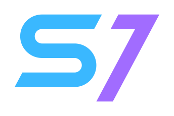
- Clear space
- One module of breathing room around the drawing, already baked into the file. Nothing — text, border or another logo — enters it.
- Minimum size
- Do not go below 16 px tall. Being SVG it grows without limit; what breaks small is reading the "7".
- Background
- Both colours were chosen to work on the light and the dark theme unchanged. There is no "dark background" variant.
Variants
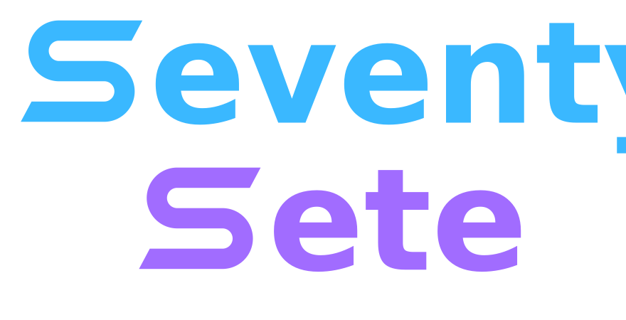
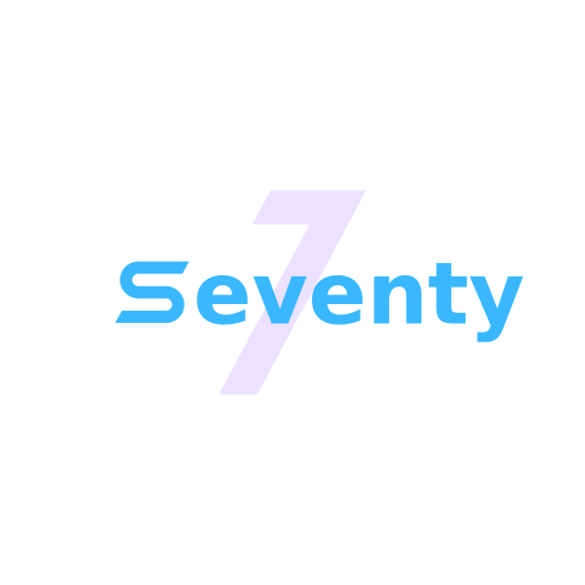
Inside an app, the mark only. The wordmarks are for pieces outside the product — they depend on an external font that the app security policy blocks.
The platform standard: favicon and brand mark in every app. No external dependency.

Product marks
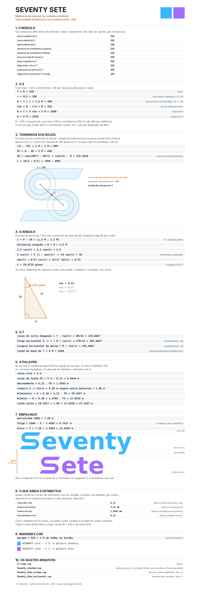
Every product has its own, derived from the same modular system as the mark: two elements, blue that contains and purple that escapes, on the 320 module and the four slopes of the 8-15-17 triangle. None of them is an interface icon — the mark comes first, and the icon only steps in for a product that has not been drawn yet.
Application
What to do and what not to do
Do
- Place it on a light or dark background without changing the colours.
- Respect the one-module margin already baked into the file.
- Use the official files from this manual as the source.
- Mark it as decorative (empty alt) when the adjacent text already names the screen.
- Prefer the SVG: it scales without losing the stroke.
Don't
- Do not recolour, gradient or invert the colours.
- Do not distort, rotate or change the proportions.
- Do not add shadow, outline, glow or texture.
- Do not redraw the mark or replace it with a font character.
- Do not use the wordmarks inside an app: they pull an external font that the security policy blocks.
Colour
Palette
Brand colours
The two colours of the mark. They are fixed: they do not follow the theme and have no contextual variation.
The "S" of the mark and the "Seventy" of the wordmarks.
The "7" of the mark and the "Sete" of the wordmarks.
Interface palette
Colour inside the product is not chosen, it is consumed as a token. Each token has a value per theme, and the interface switches on its own.
| Token | Light | Dark | Usage |
|---|---|---|---|
| --tree-color-bg-primary | #f6f8fa | #1c2128 | Page background. |
| --tree-color-bg-surface | #ffffff | #22272e | Raised surface: card, panel, menu. |
| --tree-color-bg-subtle | #eff2f5 | #2d333b | Supporting band and quiet hover state. |
| --tree-color-text-primary | #1f2328 | #adbac7 | Reading text and headings. |
| --tree-color-text-muted | #59636e | #95a3b2 | Secondary text, caption and metadata. |
| --tree-color-border-default | #d0d7de | #444c56 | Card, field and divider borders. |
| --tree-color-brand-primary | #0969da | #559cf5 | Primary action, link and focus. |
| --tree-color-brand-soft | #ddf4ff | #1a3453 | Soft highlight and selection background. |
| --tree-color-status-success | #197d36 | #5bae5e | Confirmation and healthy state. |
| --tree-color-status-warning | #946300 | #c99227 | Attention and an approaching limit. |
| --tree-color-status-error | #d1242f | #f5766e | Failure, error and destructive action. |
| --tree-color-status-info | #0969da | #6cb6ff | Neutral notice and context information. |
Never write a colour value directly in the product. Use var(--tree-color-…) — a token that does not exist raises no error, it just renders the wrong colour silently.
Typography
How the text behaves
Two families in the product and a third one only on brand pieces. The scale is closed — no size outside it.
The brand speaks clearly
"Google Sans Flex", "Segoe UI", sans-serifAll product text and this site.
The brand speaks clearly
"Google Sans Code", "SFMono-Regular", monospaceMachine text: identifier, token, address, code.
The brand speaks clearly
Gabarito, Poppins, "Century Gothic", Futura, sans-serifInside the wordmarks only. Do not use it in an interface — the font comes from an external server.
Scale
Eight steps. You use the step name, never the value.
The brand speaks clearly
The brand speaks clearly
The brand speaks clearly
The brand speaks clearly
The brand speaks clearly
The brand speaks clearly
The brand speaks clearly
The brand speaks clearly
Theme
Light and dark, decided by the user
The interface follows the operating-system theme of whoever is using it. There is no switch, and no screen forces a theme — if you chose dark in your system, you get dark everywhere, including this page.
Tone of voice
How we write
Writing is part of the brand. These four rules settle almost every wording question.
Clear before clever
Say what the thing does. A sentence that has to be read twice has lost, however pretty it is.
Concrete, no superlatives
No "revolutionary" or "market leader". Prefer the checkable fact to the adjective.
Direct and jargon-free
Speak to the person, in the second person. A technical term goes in when it is the right name, not to impress.
Honest about the state
What is under development is announced as such. Promising something is ready when it is not is the fastest way to lose trust for good.
Seventy Sete, SeventySete, S7, Space, Assistant and the product names are marks: they read the same in Portuguese, English and Spanish.
Files
Download the originals
All SVG, with no external dependency. If you need another format, generate it from these.
The platform standard: favicon and brand mark in every app. No external dependency.
The grid and dimensions that generate the mark. It is a design spec, not an application asset.
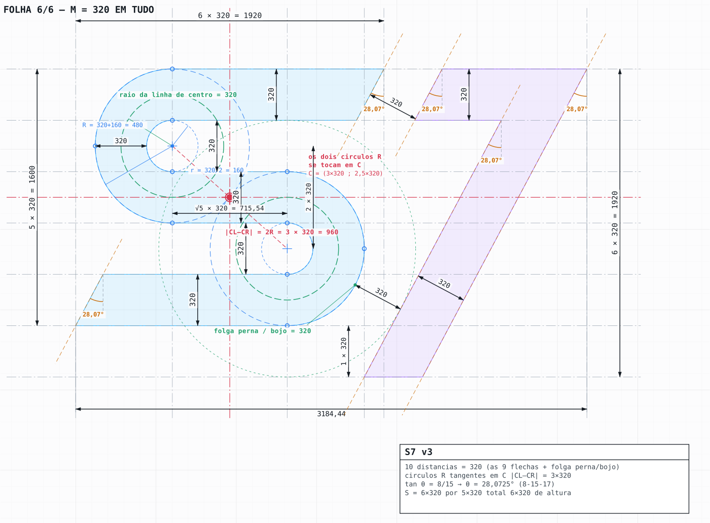
The sheet documenting the whole modular system. A reference for redrawing, never for application.